Flyers, flyers, flyers. An inexpensive but highly effective tool in your marketing arsenal. Flyers are of course easy to distribute and eye-catching whilst being a high-return marketing tool as you can reach a large audience with only minimal time and effort. You will see flyers everywhere, everyday, at work, school, in the mail, on the street floor, store windows and even the trashcan. That little piece of paper handed to you at the street crossing or buried under a pile of bills in your mail. Whilst many might end up in the trash what is important is that they were read; that their idea and message caught your eye and that maybe they might even get you to take action (eg. ‘hey, let’s buy these tickets to this concert!’).
In today’s article we will walk you through the logic and process of an designing eye-catching, stand-out attractive flyer design, ready for print. How to plan your content and message, source high quality and attention grabbing images, handle the alignments without losing any of the visual appeal.
If you need flyers printed, make sure you check out our Flyer Range here at Printing New York. All our flyers, including ‘same day rush printing flyers’ are printed using luxurious 12-14PT card stocks in either glossy, matte or uncoated finishes to suit your needs.
Use Short, Catchy Headlines
The headline is often the first thing you read on a flyer and should have the most thought put in to it. Make it short, make it sweet, make it catchy and make it STAND OUT. Reading the headline, your audience should be able to immediately understand what you do and what it is you are marketing. The headline should work with your flyer design and compliment it. It should also be easy to read! This design by Traumfahrer has a very easy to read headline:
Play With Patterns
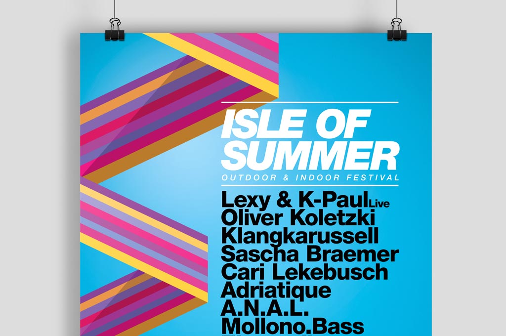
Patterns can help your flyer stand out in a unique way. As a striking visual element or just as an accent around your text and sections. The human eye naturally notices and is drawn towards patterns, geometries and complex shapes – so including them in to your designs is a fantastic way to get more people looking at your flyer.
Patterns make a striking visual statement, whether you use them throughout your design (like in this flyer by Joris Rigerl) or just as an accent. Because the human eye naturally notices patterns, including them in your design is a surefire way to get more people looking at your flyer.
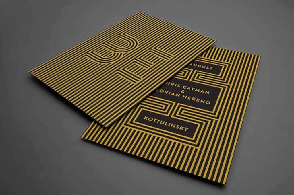
Source: Joris Rigerl
Use Bold Colors
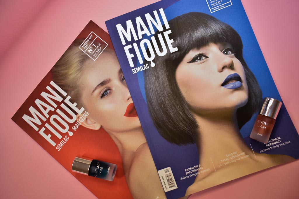
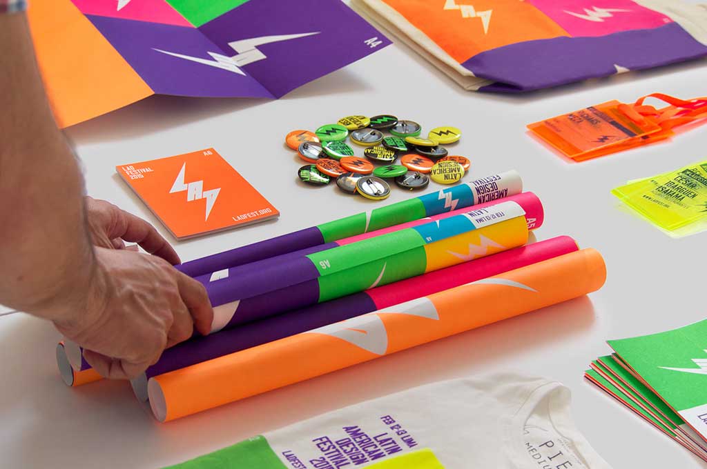
It’s easy to make your flyers stand out with a bright, punchy color palette. Bright colors demand attention, even from across the room. Combine bright colors with strong contrasting fonts to help your artwork make a difference. These LADfestival Flyers by IS Creative Studio use an incredibly stand out fluro color palette to catch the eye.
Get Seasonal
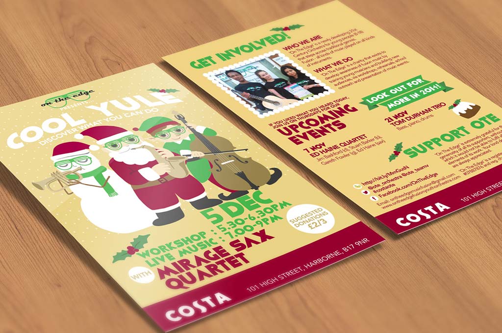
Use your flyer to capitalize on holidays and seasonal times of the year. Think Christmas, Easter, Cinco de Mayo, 4th July or New Years Eve! There are many relevant options to choose and designing your flyer with the imagery and history associated with that occasion can be a winning strategy. Your audience will immediately engage with the design as it feels nostalgic and familiar. These Christmas flyer designs for Costa Coffee by Christi Guan are a great example.
Make it Minimalist
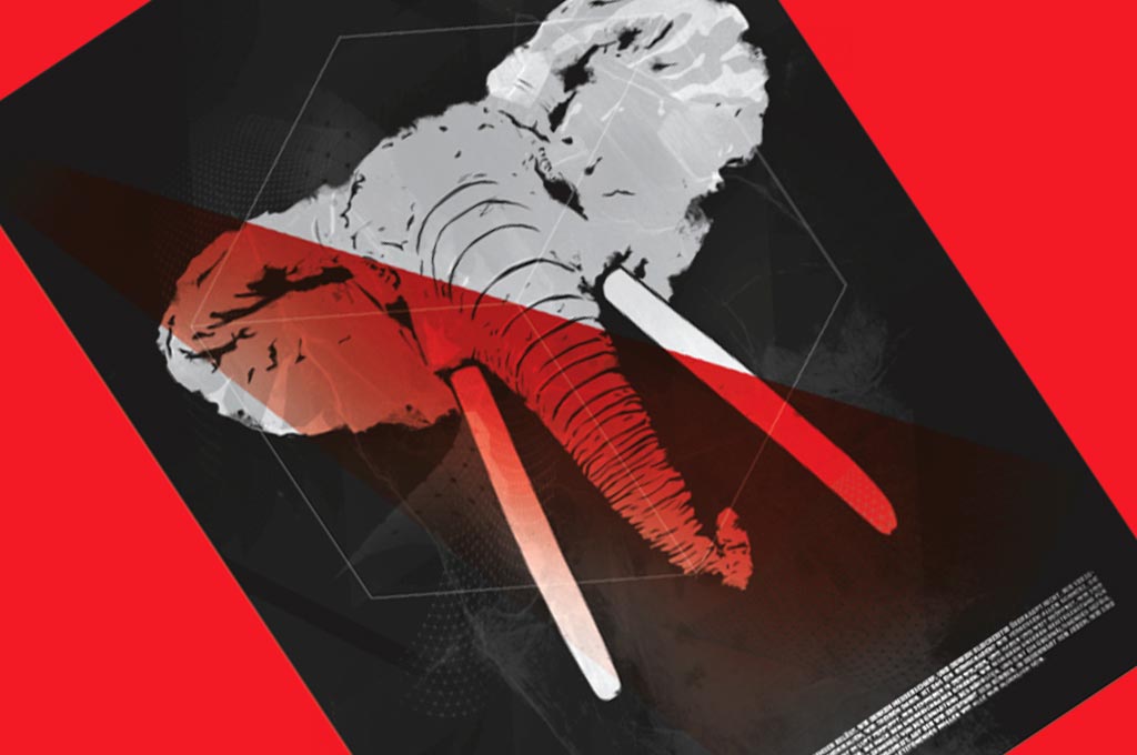
To direct your audience to key points of your flyer, try a minimalist design. Large, successful companies such as Apple embrace minimalism in their design portfolio – it really works! People enjoy it, it looks professional, it helps your viewers narrow in on your key message. Try a minimalist flyer design today. This design by Traumfahrer uses a single image of an elephant on a dark background. The content is stripped down to only what is necessary, creating mystery and gauging interest in the flyer. The design draws you in to the logo which is silhouetted over the elephant. Before you realise you are already reading the small print at the bottom of the flyer.
